A Short Bit On Colours
| 8 mins | Bobtags: photography, visualisation, coding
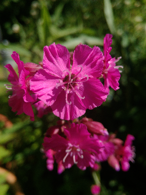
Have you ever wondered why some colours look weird and unnatural when taking a picture of them on your phone? I’m seeing this in photos of vibrant flowers quite often. For example, take a look at this one I took with a bad phone camera to emphasise the problem:
At first, it might seem normal, but look at the out-of-focus parts more closely:
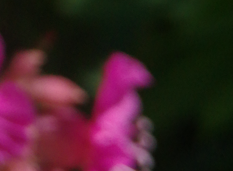
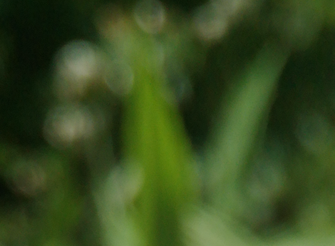
They aren’t all that smooth as they should, right? It is largely because of the bad optical properties of the phone’s lenses, but it’s made even more present because of colour clamping. That is a phenomenon where part of an originally smooth colour gradient is cut off and replaced by the outermost colour that is still within the allowed range. I’ve tried to simulate this here:


Both are a simple linear gradient from one colour to another, but in the second image I have chosen a “maximum” value for the left colour. This is as if the original left colour is not possible to display and is thus clamped to the last one that is. As you can (hopefully) see, the rest of the gradient did not change but the transition from possible colours to impossible colours suddenly looks sharper – because there is nothing for the eye to continue with. The transition is located at about 1/3 of the gradient’s width.
What I’m showing there is not what actually happens with the photos, but the effect is visually similar – I just wanted you to clearly see what I’m talking about. Also, it is not “banding” if you had that in mind. Banding is caused by low bit-depth, which limits the possible colour values overall and leads to stripy gradients.
Ok, let’s get back to the flower image. I have set up the phone to save a RAW file of the image next to the usual JPG you have seen above. RAW in this case means plain and unprocessed data which is not bound to any colour space – just limited by the physical possibilities of the camera sensor. The result1 looks a bit different and not as vibrant as the JPG:
Let me explain why that is and what happens, when the camera converts the captured RAW into a JPG. For that you’ll have to know a bit about colour spaces, so here is a graph2 you have probably seen before somewhere:
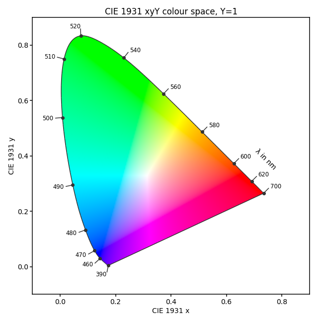
You can ignore the axes, but the rainbowy horseshoe is very important. In fact, all colours of the rainbow and thus the entire visible spectrum are located right at the edge of the shape – the wavelengths \(\lambda\) in nanometres are annotated. Everything else apart from the horseshoe’s edge is not pure light but a mix of different wavelengths.3
Now the not so fun part begins: The colours you see are not even the actual colours described by the diagram. What? Yes, confusing, but it is just because your display can’t depict them. Maybe you can spot a weird triangle within the horseshoe that looks a bit brighter than the rest and has its corners in the blue, green and red area. The triangle’s edge you are seeing is precisely caused by the phenomenon I showed you above with the gradients. Only colours within the triangle are correctly displayed by your screen, everything outside is clamped to a colour that lies on the triangle’s edge. If you look closely (especially visible in the greens), you’ll realise that the colours are not actually changing to any new values. What you are seeing as a triangle is probably close to or a bit less than the sRGB colour space, as most display can’t show more than that. I’ll show the actual boundary of this colour space (called a gamut) in the next graphs.
I have now extracted a list of pixels from both the JPG and the RAW image (about every 2500th pixel) and computed their position inside the colour space diagram.4 Here are the RAW pixels:
![]()
You can see several things here: First of all, the image mainly consists of red, yellow and green tones – almost no blues are present. Secondly, oh lord of the flies, there are colours captured that are not even visible to the human eye! The pixels below the horseshoe are from infrared and ultraviolet wavelengths, isn’t that exciting? You’ll find those being emitted by a lot of flowers for insects to see. Above the horseshoe are also some invisible “green” colours, and I’m not entirely sure how you could imagine them, but they clearly form a straight edge – at the camera’s physical limit.
The phone has a problem now because what should it do with those invisible wavelengths it recorded? If it kept them invisible, you’ll get transparent (or black?) areas on the image, and they look weird. Nobody wants holes in his selfie, right? So what the phone does is calculating a colour it could show instead. It is surely using some fancy algorithms I have no idea of but what we can do is look at the outcome:
![]()
What a difference! All pixels are now moved inside the sRGB gamut so that everything can be displayed correctly. You’ll also find other previously fine pixels being moved around. That’s because of some editing the phone automatically applied to make the image look better. In order to not being bothered by them, I filtered the pixels and now show only the transformations. In blue, you see the original RAW pixels and in black the same pixels but transformed into the sRGB region; pixels that were previously within sRGB already are not shown:
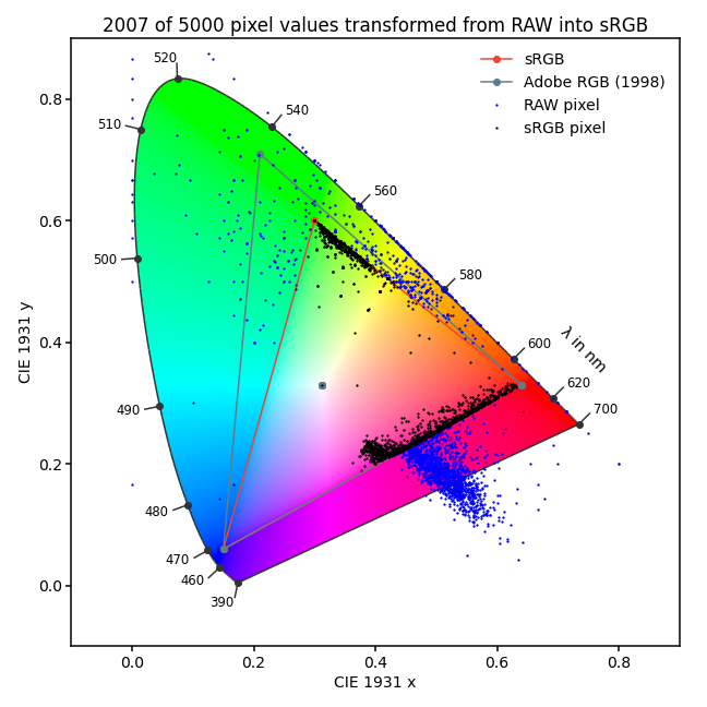
I find the result quite revealing – you can clearly see how a wide colour gradient was cut off and pushed into the allowed region. The colours are still a bit spread, but their originally smooth variations now ends sharply at the corner of sRGB. This edge is often visible in photos as I showed you in the beginning and I hate it!
Of course, leaving the RAW image as is also doesn’t help as the problematic pixels can’t be shown correctly anyway, but you can edit it in such a way that the colours are not being crammed onto the edge of what’s possible when converting into sRGB – by taking the limited colour space into account. But I will talk about that another time as this post is already a bit lengthy.
PS: Sorry for the longer pause in blog posts, I was busy with my beloved attractors and writing something new takes longer than you might guess. I want to provide fairly accurate content and somehow keep it short but also as interesting as possible for you to enjoy. So, good day and see you later.
-
The RAW image is not displayed correctly either as it contains colours that are not possible to be shown on your screen or even to be visible by your eye (and it is converted to sRGB for the web anyway). ↩
-
You might want to read Wikipedia’s article about the CIE 1931 xyY colour space for more details. ↩
-
If you are looking at this on a screen (or did you print it?!?), you’ll just see pure red, green and blue wavelengths and not yellow wavelengths for example as RGB pixels create a mixture with them. ↩
-
I used rawpy for pixel extraction, Pillow for image rendering and colour for the colour space plots. You can find the source-code on GistHub. ↩

Alex, 2022-01-13 04:51
From some other article ( https://vas3k.com/blog/computational_photography/ ) I learned that there is so much more going on inside modern phones that the end result can be very far from real representation.
random anon, 2021-09-14 17:31
Never expected I would be interested in a color-pixel article. Kinda reminds me of reading why CRT televisions are better for most videogames, good post
Bumble, 2021-06-09 22:38
Learned a thing or two about color ranges thanks to this, good read. MORE POSTS PLEASE!!!!
Bob, 2021-06-09 22:57
Thank you, that’s nice to hear! I have other topics in preparation, but I’ll need more time. So be patient :)