CodingBobby / Traktify's Logo
Designing the icon for Traktify involved a process of changing and tweaking things to improve it. Because the app development started at a fast pace, the icon development didn’t have enough time to go through many iterations. As a result, the first logo was far from polished.
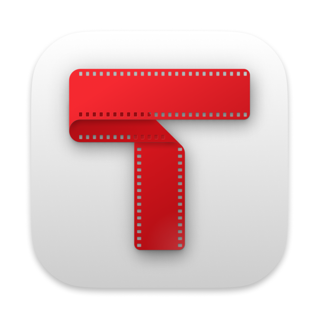
Here, some of the logo iterations are shown – the topmost one is the latest.
3rd Iteration
This iteration was a big step forward and many things have changed:
- the film-strip finally got properly sized sprocket holes (holes around the folding curves are intentionally left out as they would be too complicated and messy to look at)
- added parts of the film behind the holes, which were somehow forgotten before
- shadows and highlights on the film emphasize how it is folded
- subtle gradients help the icon to stand out and feel more plastic

2nd Iteration
The purpose of this iteration’s changes was to make the icon usable at smaller sizes.
- increased size of sprocket holes
- darkened the backside of the strip

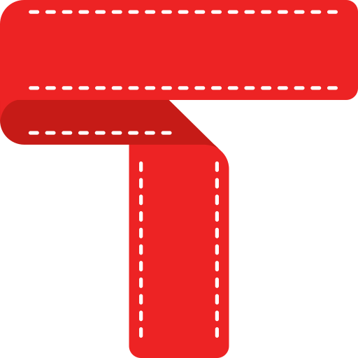
1st Iteration
Traktify’s icon contains three things:
- the letter “T” to provide an anchor for the design to depend on
- a film strip, indicating the topic and purpose of this app – organising your movies and tv shows
- the colour red, a connection to trakt.tv which is the underlying service the app is built on

